| |
Logos and Branding
|
|
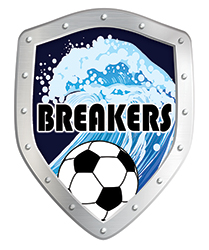
Client: Breakers Football team
Project: logo
My client coaches the Year 6 Junior, Breakers team, of Grants Braes AFC Dunedin Football Club and asked me to design a logo that incorporate breaking waves. |

|
Client: Pediatrist-Neonatologist
Project: business card
My client owns a private clinic as well as works in a Hospital and a Specialist Centre. He asked me to design a double sided business card that shows the most prefered toys of his young patients. |

|
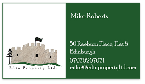
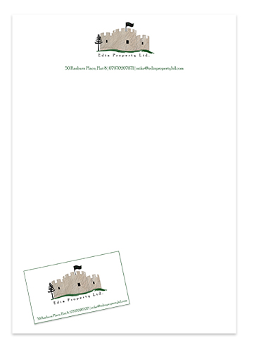
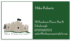
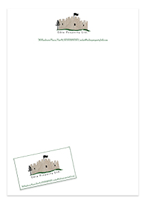
Client: Edin Property
Project: logo and stationery
My client owns a real state company in Edinburgh, Scotland, and wanted a logo that specificaly contains his Farquharson clan flag as well as the siluette of the Braemar castle. I also designed the stationery. |

|
Client: Japo
Project: logo
My client owns a Japanese toy shop and he asked for the creation of a logo that connotes movement, games, happiness and kids.
I designed this logo inspired in the silhouette of a child summersaulting and, at the same time, the eyes of his mother, who always wants the best for her child and of course that is who has the final decision of purchase. I used the same red colour of the Japanese flag and also, a font that has some similarity to the dynamic Japanese characters but of course that is legible for occidental customers.
|

Stationery Parelsol

|
Client: Parelsol S.A.
Project: logo and stationery
Parelsol is a company that sells parasols. I designed a typographic logo that included an icon, in orange and red colours, that represents the sun and the sunrays, as well as respresenting the superior view of a umbrella. |

Promotional material

|
Client: Silver jewellery Pre-Columbian Cuencan shop
Project: Logo and packaging
Joyas de plata is a shop of silver jewellery specializing in Pre-Columbian designs. They wished to have a simple logo in black colour that reflects one Pre-Columbian element, so I chose to work with a Pre-Columbine snake shape. I designed the logo, which was applied to signs inside the shop window, business card, and also a bag with the shape cut of logo icon.
|

Stationery FETUR

|
Client: Fetur S.A.
Project: logo and stationery
At a workshop in my University, we were engaged to create a communication plan that included: branding design, slogan and a complete advertising campaign for the Ecuadorian company of tourist railways, Fetur S.A. I designed a typographic logo using the brand name and the colours of the Ecuadorian flag: yellow, blue and red. I created an icon inspired by the locomotive (train engine) and I added the slogan "Encarrilate al Ecuador" (English translation, "get back on track to Ecuador"), devised for the advertising campaign. The slogan was applied to all the corporative graphic supports to help the fast positioning of the campaign concept. The logo was applied to business cards, stationery and stickers.
Others clients:
Pow™ Yerba Mate
Carvieira Handicrafts Ecuador
Hostel Llanovientos
Back to Nature Tours |