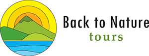
Original 1997 company logo

|
Design Process - Logo BTN Tours Dunedin 2012 |


|

|
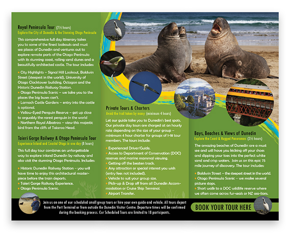
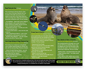
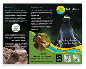
Diptych Brochure and A3 Poster -
Displayed in the i-SITE at Port Otago


|
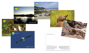
Postcards for clients
|
| Stationery - A4 sheet

|
Company manuals

|
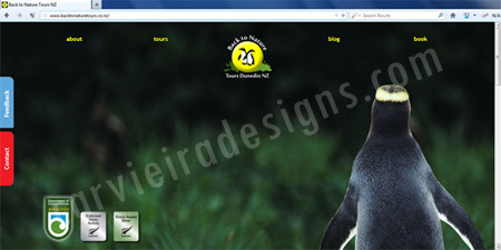
Website's Home Page
|
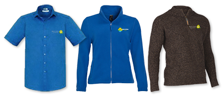
Staff uniform
|
2014 Design Process - Redesign of company logotype |
|
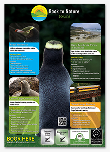
Tri-Fold Brochure
|
A3 Poster displayed in the i-SITE at Port Otago
|
| Double-sided business cards

|
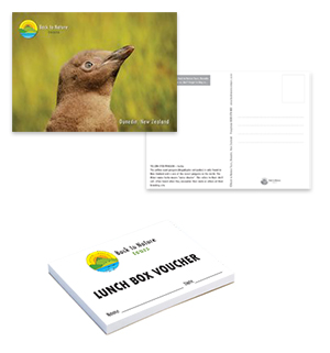
Postcards and lunch vouchers for clients
|
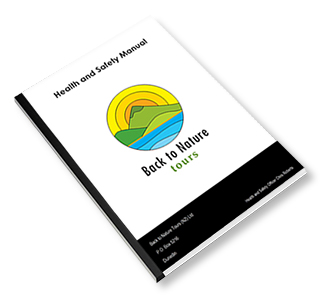
Health and Safety company manual
|
Postcards and lunch vouchers for clients
|
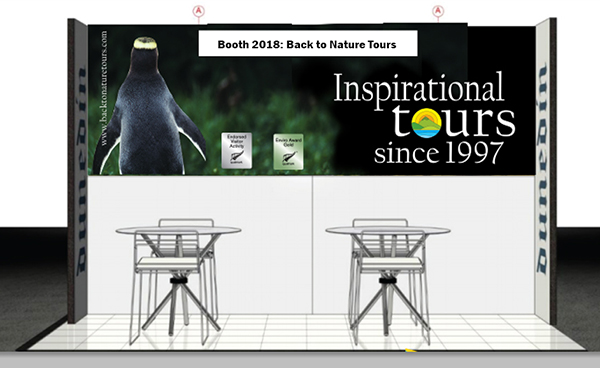
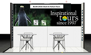
Booth design for the BTN stand at the 2018 TRENZ -
International tourism business event
|
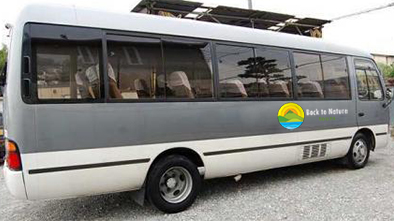
Signage in company's buses
|
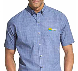
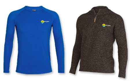
Staff uniform and name tag
|
|
Client: Back to Nature Tours
The Design and development process of its brand, logo and its applications
Back to Nature Tours is a tourism company that provides experiences that showcase the symbiotic relationship between New Zealand nature (remote and well known coasts and inland landscapes) and its culture with an emphasis on conservation.
In 2012, its new owner asked me to improve the original company 1997 logo for the Dunedin market. He wanted a logo that connects nature (coast and inland landscape) with the yellow-eye penguins found in Otago Peninsula. This logo was going to be used in apps, Website and printed promotional material.
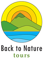
The logo I designed, keeps the main circular icon from its original version and incorporates the shape of waves, together with the green shades found along the beach's flora. The logo has a variation in blue shade on its waves to refer to the tours outside Otago region.
This logo has also a horizontal version and was used to promote the brand of the company in a range of visual and printed material: business manuals, business cards and stationery, tri-fold brochures, A6 post cards, posters for events and cruise ships, engraved wooden name tags, souveniers, magnetic car signs and Website.
Due to the increasing demand for tours outside the Otago region, the owner of Back to Nature Tours decided to redesign the company's logo with a fresh look, without the penguins icons on it.
By 2014, Back to Nature Tours grew significantly and its tour services not just covered the Otago Region but also Akaroa, Christchurch and Tauranga regions. Its owner needed a new fresh looking logo that could embrance all those regions wonders.
I redesigned the logo inspired in the colours and elements of nature.
Others clients:
Hostal Llanovientos
More logos and branding
Pow™ Yerba Mate
Carvieira Handicrafts Ecuador
|